
Color Theory Terminology
Complementary colors: Two colors that are on opposite sides of the color wheel. This combination provides a high contrast and high impact color combination – together, these colors will appear brighter and more prominent.
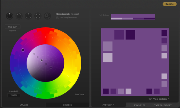
Monochromatic: Three shades, tones and tints of one base color. Provides a subtle and conservative color combination. This is a versatile color combination that is easy to apply to design projects for a harmonious look.
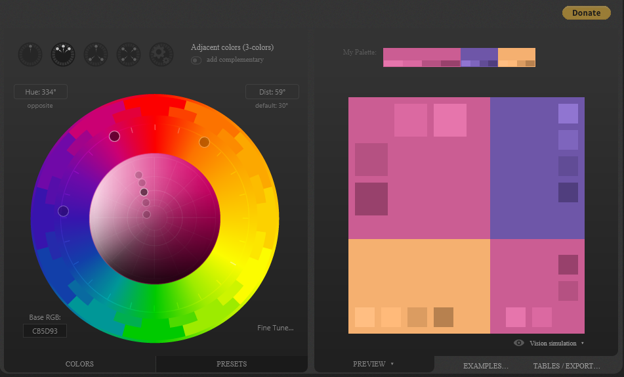
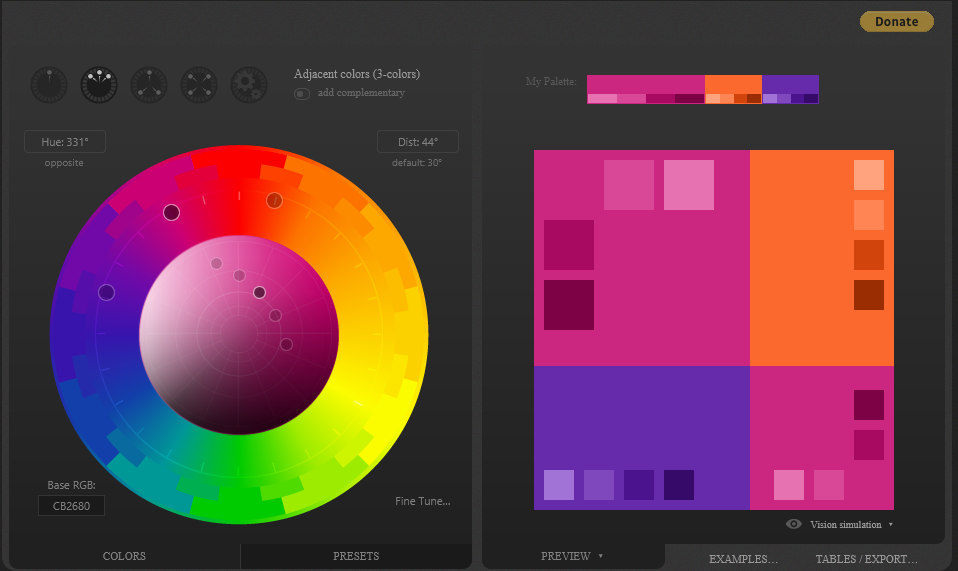
Analogous: Three colors that are side by side on the color wheel. This color combination is versatile, but can be overwhelming. To balance an analogous color scheme, choose one dominant color, and use the others as accents.
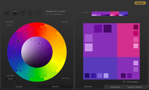
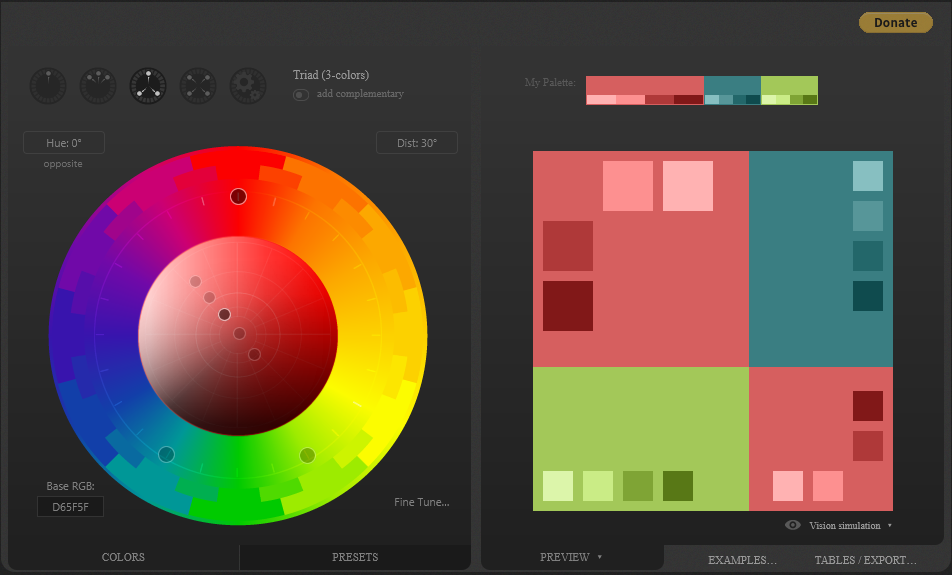
Triadic: Three colors that are evenly spaced on the color wheel. This provides a high contrast color scheme, but less so than the complementary color combination — making it more versatile. This combination creates bold, vibrant color palettes.
Tetradic: Four colors that are evenly spaced on the color wheel. Tetradic color schemes are bold and work best if you let one color be dominant, and use the others as accents. The more colors you have in your palette, the more difficult it is to balance.
Primary, secondary and tertiary colors:
Primary colors in the RGB color wheel are the colors that, added together, create pure white light. These colors are red, green and blue.
Shades, tints, and tones:
A shade is created by adding black to a base hue, darkening the color. This creates a deeper, richer color. Shades can be quite dramatic and can be overpowering.
Hue, saturation and luminance:
Warm colors: Warm colors are the colors from red through to yellow. These colors are said to bring to mind warmth, like the sun.
Cool colors: Cool colors are the colors from blue to green and purple. These colors are said to bring to mind coolness, like water.
My Favorite Color
My favorite color: Light Purple: #bda8c6
Complementary color: Pale Green #b1c6a8
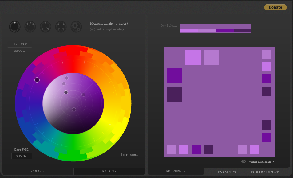
Monochromatic color: Purple #a589b1
Analogous color: Pinkish Purple #c6a8c0 and Blueish Purple #aea8c6
Triadic color: Faded Yellow #c6bda8 and Faded Green #a8c6bd
Paletton Color Palettes
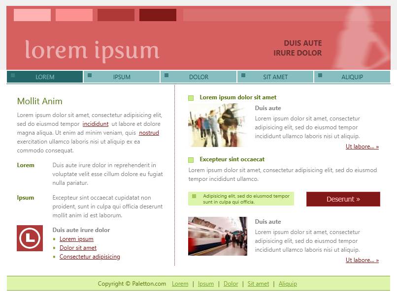
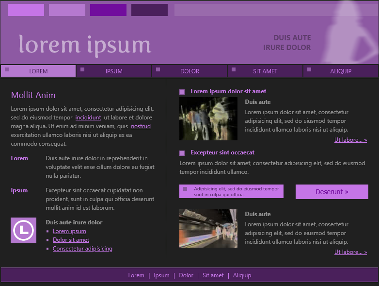
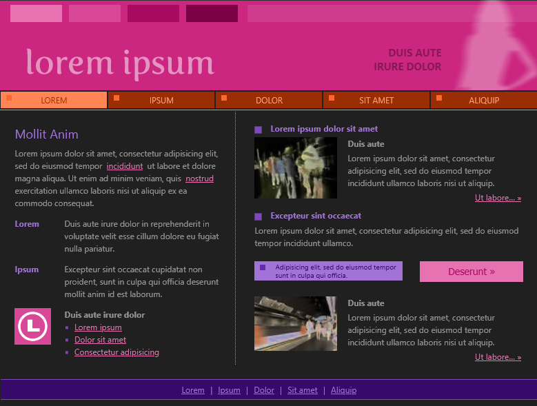
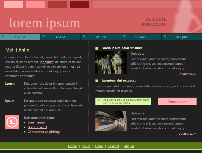
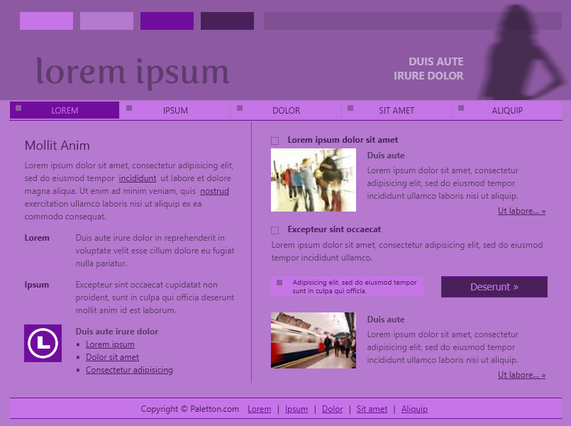
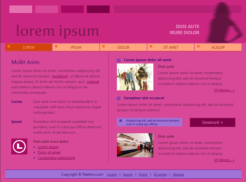
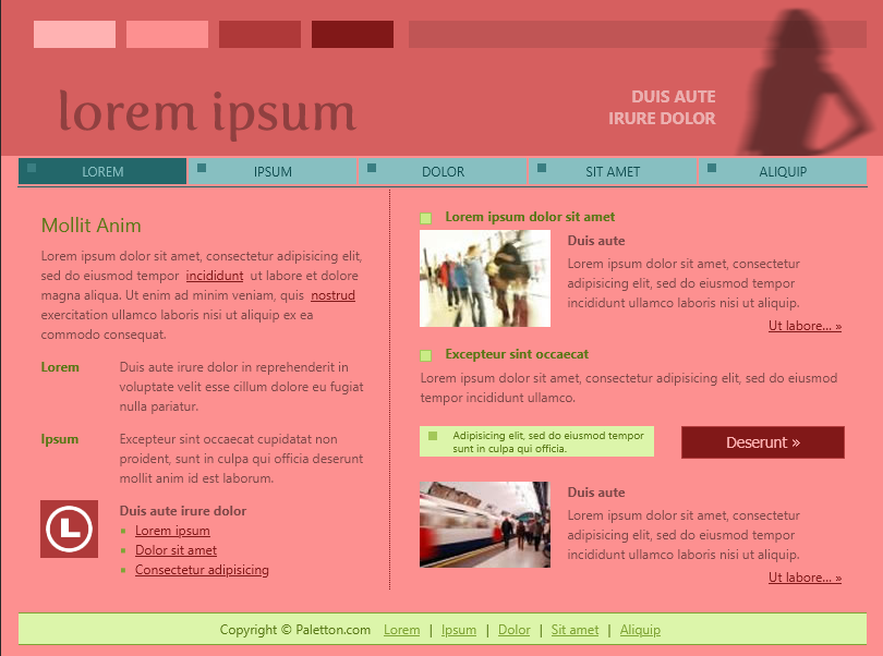
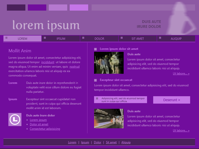
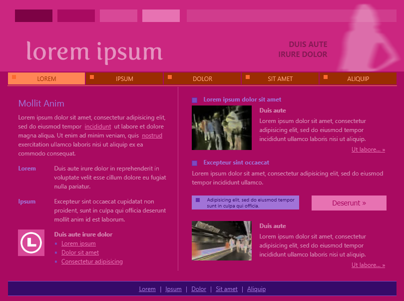
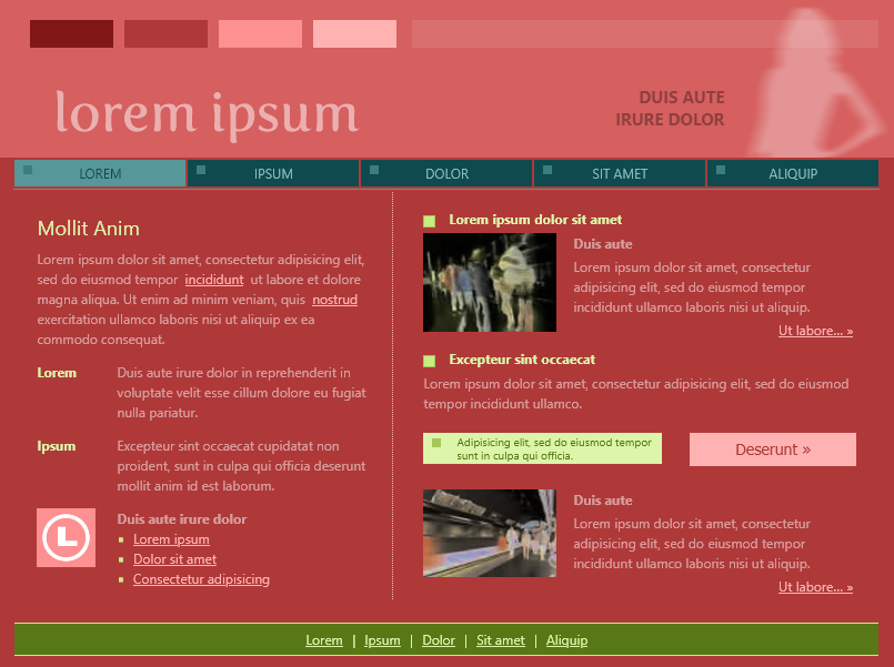
Paletton is a cool site for finding a color palette and testing its visibility as a website. There are features to simulate color blindness and to view the colors as web colors. The color selection tool is interesting and with free style mode you can really get any combination of colors that you want. There is a good amount of presets and there are options to view the preview in different layouts. Here are some of my favorite color palettes.
Exploring Page Layouts
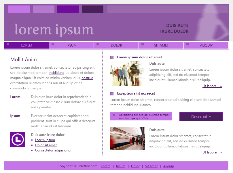
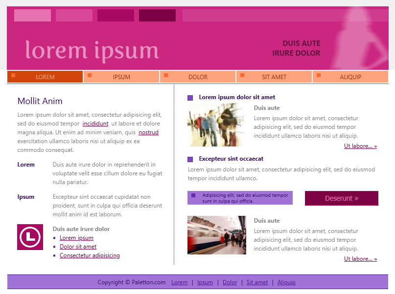
Check out these page layouts for each of the color palettes above.
Favorite Canva Color Palettes
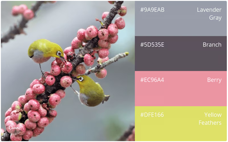
Birds and Berries
I like this color combination because the colors are vibrant and the contrast between the colors make the palette stand out.
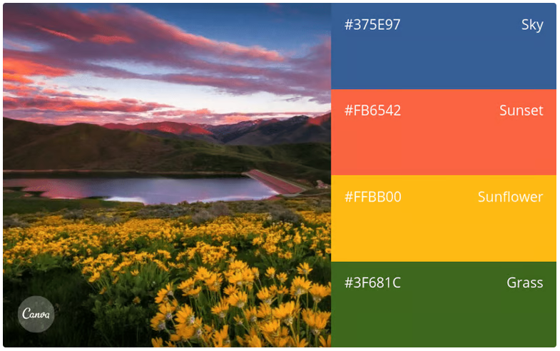
Primary Colors with a Vibrant Twist
I like how this palette has colors named Sky, Sunset, Sunflower, and Grass. These are lovely, natural colors, and I like how their names reflect what is shown in the photograph.
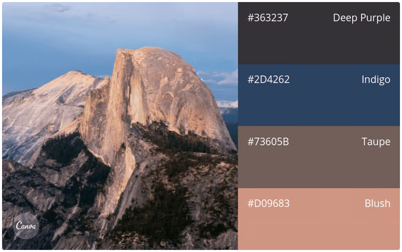
Sunset to Dusk
I like the softer colors in this palette and how they create a more calm atmosphere. These would be good colors for the design of a more artistic website.